
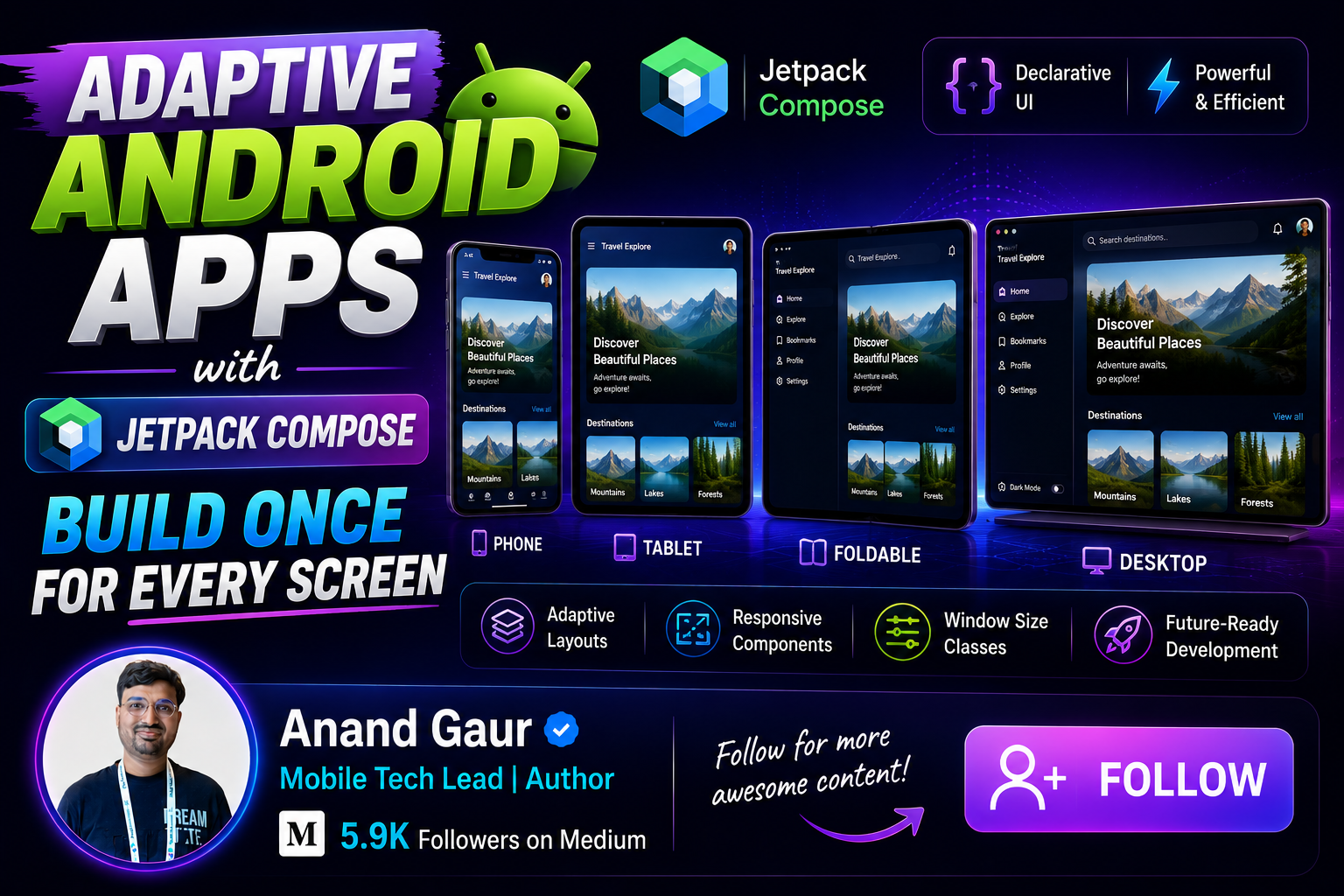
Have you ever opened an app on a tablet and felt like you were looking at a stretched phone app? A huge blank space on both sides, one giant list in the middle, and buttons that look lost on the big screen. That is exactly the problem adaptive apps solve.
In this blog, we will go from absolute basics to advanced concepts of building adaptive Android apps with Jetpack Compose. By the end, you will understand what adaptive apps are, why Google pushed this idea so hard, what problems existed before, how to set everything up, and how to build real-world adaptive layouts step by step. My goal is simple: after reading this one blog, you should not need to read any other blog on this topic.
Let us start from the very beginning.
The World Before Adaptive Apps: What Was the Problem?
To understand why adaptive apps exist, we need to go back in time a little.
1. Android was born for one screen size
When Android started in 2008, almost every device was a small phone. Developers designed one layout, tested it on one or two phones, and shipped the app. Life was simple.
Then the ecosystem exploded. Today Android runs on:
-
Small phones and big phones
-
Foldables (like Samsung Galaxy Fold and Pixel Fold) that change size while the app is running
-
Tablets of many sizes
-
Chromebooks where apps run in resizable windows
-
Desktop mode where a phone connects to a monitor
-
Cars, TVs, and even XR headsets
There are more than 3 billion active Android devices, and they come in thousands of screen shapes and sizes. One fixed layout simply cannot work for all of them.
2. The old solutions were painful
Before Compose and adaptive APIs, developers tried to handle this in the XML world using these tricks:
a) Multiple layout folders
We used to create separate XML files for different screens:
res/layout/activity_main.xml          -> phones
res/layout-sw600dp/activity_main.xml  -> 7 inch tablets
res/layout-sw720dp/activity_main.xml  -> 10 inch tablets
res/layout-land/activity_main.xml     -> landscape
The problem? You are now maintaining 3 or 4 copies of the same screen. Change one button, and you must change it in every file. Miss one file and you get a bug that only appears on tablets. Testing became a nightmare.
b) The sw600dp assumption broke down
The whole system assumed a simple rule: “small screen means phone, big screen means tablet.” Foldables destroyed this assumption. A foldable is a phone when closed and a tablet when open, and it switches between the two while your app is running. Chromebooks made it worse because the user can resize your app window with a mouse, just like on a desktop, so your app can go from tiny to huge in one drag.
c) Fragments with dual-pane logic
Google’s old advice was to use Fragments: show one Fragment on phones, and two Fragments side by side on tablets. It worked, but the code was complex. You had to manage two different navigation flows, handle back stack differently on each device type, and keep both flows in sync. Many teams simply gave up and shipped the stretched phone UI on tablets.
d) Checking the device instead of the window
A very common old mistake was code like this:
val isTablet = resources.configuration.smallestScreenWidthDp >= 600This checks the device. But on a foldable or a Chromebook, the device size does not tell you the window size. Your app might be running in split-screen mode on a huge tablet, getting only half the screen. Device checks give the wrong answer in all these cases.
3. Why Google suddenly started caring so much
A few things happened together:
-
Foldables became mainstream and their sales kept growing every year
-
Large screen Android devices (tablets, foldables, Chromebooks) crossed hundreds of millions of active users
-
Google launched the Pixel Tablet and Pixel Fold, so they needed the ecosystem to look good on them
-
Play Store started ranking and reviewing apps based on large screen quality, and it shows warnings for apps that are not optimized
-
Android 16 introduced an even bigger change: on large screens, the system ignores fixed orientation and resizability restrictions. Apps can no longer say “I only run in portrait.” Your app will be resized whether you like it or not
So the message from Google became loud and clear: your app does not run on a device, it runs in a window, and that window can be any size. Design for the window.
This is exactly where adaptive design and Jetpack Compose come in.
What Exactly is an Adaptive App?
Let us define it in one line:
An adaptive app changes its layout based on the space available to it, so that it always makes the best use of the screen.
Notice the words carefully: “space available to it,” not “device it runs on.”
A simple example makes it clear. Think of Gmail:
-
On a phone, you see a list of emails. Tap one, and it opens a new screen with the email content.
-
On a tablet, you see the list on the left and the opened email on the right, both at the same time.
Same app, same feature, but the layout adapts. That is adaptive design.
Responsive vs Adaptive: are they the same?
People use both words loosely, but there is a small difference:
-
Responsive means the UI stretches and shrinks smoothly. A grid showing 2 columns becomes 4 columns on a wider screen.
-
Adaptive means the UI structure itself changes. A bottom navigation bar becomes a navigation rail. A single-pane screen becomes a two-pane screen.
In practice, a good adaptive app does both. Compose gives us tools for both, and we will cover all of them.
Why Jetpack Compose is perfect for this
In the XML world, adapting meant maintaining multiple layout files. In Compose, your UI is just Kotlin code. An if condition can decide the entire structure of your screen:
if (windowIsWide) {
    TwoPaneLayout()
} else {
    SinglePaneLayout()
}
One codebase, one screen, one source of truth. This is why the title of this blog says “Build Once for Every Screen.” Compose makes adaptive design a normal programming problem instead of a resource-folder juggling act.
The Foundation: Window Size Classes
Now we start with the most important concept in the whole adaptive world: Window Size Classes.
The idea
You cannot write separate code for every possible width like 320dp, 411dp, 600dp, 840dp, and so on. So Google grouped all possible window sizes into a few named buckets called size classes.
For width, the buckets are:
Width Size Class Window Width Typical Example Compact less than 600dp Phone in portrait Medium 600dp to 839dp Foldable open, small tablet, phone in split screen Expanded 840dp to 1199dp Tablet in landscape, Chromebook window Large 1200dp to 1599dp Big tablet, desktop window Extra Large 1600dp and above Full desktop, external monitor
(Large and Extra Large were added recently in the newer versions of the library. For most apps, handling Compact, Medium, and Expanded covers almost everything.)
For height, there are three buckets: Compact, Medium, and Expanded. Height classes are useful for things like landscape phones, where the width is fine but the height is very small.
The golden rule
Always make layout decisions based on the window size class, never based on the device type, screen size, or orientation.
Why? Because:
-
A tablet in split-screen mode gives your app a Compact window
-
A foldable changes from Compact to Medium or Expanded when unfolded
-
A Chromebook user can drag your window to any size
-
Android 16 on large screens will resize your app freely
The window is the truth. The device is a lie.
About 90 percent of devices at these breakpoints
One more practical fact: the 600dp and 840dp numbers are not random. Google analyzed the entire device ecosystem and picked breakpoints so that most real devices fall clearly into one bucket. Phones in portrait are almost always under 600dp wide. Unfolded foldables usually land in Medium. Tablets in landscape land in Expanded. So these three buckets map beautifully to the real world.
Setting Up Your Project
Let us get our hands dirty. Here is everything you need.
Step 1: Add the dependencies
In your module level build.gradle.kts:
dependencies {
    // Core adaptive APIs: gives you currentWindowAdaptiveInfo()
    implementation(”androidx.compose.material3.adaptive:adaptive:1.1.0”)

// Adaptive layouts: ListDetailPaneScaffold, SupportingPaneScaffold
    implementation(”androidx.compose.material3.adaptive:adaptive-layout:1.1.0”)
    // Navigation helpers for the scaffolds above
    implementation(”androidx.compose.material3.adaptive:adaptive-navigation:1.1.0”)
    // NavigationSuiteScaffold: auto-switching navigation bar / rail
    implementation(”androidx.compose.material3:material3-adaptive-navigation-suite:1.3.2”)
}
A quick note on what lives where, because this confuses many developers:
-
material3.adaptivelibraries give you window info and the pane scaffolds -
material3-adaptive-navigation-suitegives you the smart navigation component -
Under the hood, these use the
androidx.windowlibrary, which reads the real window metrics from the system
Step 2: Make sure your Activity supports resizing
In AndroidManifest.xml, do not lock the orientation and do not disable resizing:
<activity
    android:name=”.MainActivity”
    android:exported=”true”>
    <!-- Do NOT add android:screenOrientation=”portrait” -->
    <!-- Do NOT add android:resizeableActivity=”false” -->
</activity>
If your app locks portrait today, remember that Android 16 ignores this on large screens anyway. It is better to remove the restriction yourself and handle all sizes properly.
Step 3: Handle configuration changes gracefully
When a foldable unfolds or a window resizes, the Activity may be recreated. Compose handles most of this well if you follow normal state practices:
-
Use
rememberSaveablefor UI state that must survive recreation -
Keep business state in a
ViewModel -
Never store “isTablet” style flags anywhere
That is it. No special manifest flags are required for basic adaptive behavior.
Level 1 (Basic): Reading the Window Size Class
Here is the simplest possible adaptive code. This one function is the heart of everything:
import androidx.compose.material3.adaptive.currentWindowAdaptiveInfo
import androidx.window.core.layout.WindowWidthSizeClass

@Composable
fun HomeScreen() {
    val windowSizeClass = currentWindowAdaptiveInfo().windowSizeClass
    when (windowSizeClass.windowWidthSizeClass) {
        WindowWidthSizeClass.COMPACT -> {
            CompactHomeLayout()   // single column, bottom nav
        }
        WindowWidthSizeClass.MEDIUM -> {
            MediumHomeLayout()    // maybe 2 columns, nav rail
        }
        WindowWidthSizeClass.EXPANDED -> {
            ExpandedHomeLayout()  // two panes, nav rail or drawer
        }
    }
}
currentWindowAdaptiveInfo() is a composable function that gives you live information about the current window. The magic part: when the window size changes (fold, unfold, resize, split screen), Compose automatically recomposes and your when block picks the new branch. You write zero code for detecting the change.
A tiny but complete example
Let us build a profile card that shows image and text vertically on phones, and side by side on bigger windows:
@Composable
fun ProfileCard() {
    val widthClass = currentWindowAdaptiveInfo()
        .windowSizeClass.windowWidthSizeClass

if (widthClass == WindowWidthSizeClass.COMPACT) {
        Column(horizontalAlignment = Alignment.CenterHorizontally) {
            ProfileImage()
            ProfileDetails()
        }
    } else {
        Row(verticalAlignment = Alignment.CenterVertically) {
            ProfileImage()
            Spacer(Modifier.width(24.dp))
            ProfileDetails()
        }
    }
}
Congratulations, you just wrote your first adaptive UI. Everything else in this blog is a more powerful version of this same idea.
Level 2 (Intermediate): Adaptive Navigation with NavigationSuiteScaffold
Navigation is the first thing users notice on a big screen. Material Design guidance is:
-
Compact window: Bottom Navigation Bar (thumb friendly)
-
Medium window: Navigation Rail on the left (vertical strip of icons)
-
Expanded and larger: Navigation Rail, or a Permanent Navigation Drawer for apps with many destinations
Writing this switching logic by hand is boring. So Material 3 gives us NavigationSuiteScaffold, which does it automatically:
enum class AppDestination(val label: String, val icon: ImageVector) {
    HOME(”Home”, Icons.Default.Home),
    SEARCH(”Search”, Icons.Default.Search),
    PROFILE(”Profile”, Icons.Default.Person)
}

@Composable
fun App() {
    var currentDestination by rememberSaveable {
        mutableStateOf(AppDestination.HOME)
    }
    NavigationSuiteScaffold(
        navigationSuiteItems = {
            AppDestination.entries.forEach { destination ->
                item(
                    selected = destination == currentDestination,
                    onClick = { currentDestination = destination },
                    icon = { Icon(destination.icon, contentDescription = destination.label) },
                    label = { Text(destination.label) }
                )
            }
        }
    ) {
        // Screen content for the selected destination
        when (currentDestination) {
            AppDestination.HOME -> HomeScreen()
            AppDestination.SEARCH -> SearchScreen()
            AppDestination.PROFILE -> ProfileScreen()
        }
    }
}
Run this on a phone: you get a bottom bar. Run it on a tablet or unfold a foldable: the bottom bar becomes a navigation rail on the left. You wrote the navigation once, and it adapts everywhere. This single component removes a huge amount of boilerplate.
If you ever need custom control, you can override the decision:
val adaptiveInfo = currentWindowAdaptiveInfo()
val layoutType = if (
    adaptiveInfo.windowSizeClass.windowWidthSizeClass == WindowWidthSizeClass.EXPANDED
) {
    NavigationSuiteType.NavigationDrawer
} else {
    NavigationSuiteScaffoldDefaults.calculateFromAdaptiveInfo(adaptiveInfo)
}

NavigationSuiteScaffold(
    layoutType = layoutType,
    navigationSuiteItems = { /* ... */ }
) { /* content */ }
Level 3 (Intermediate Plus): Canonical Layouts
Google studied hundreds of well-designed large screen apps and found that most good adaptive screens follow one of three patterns. These are called canonical layouts. Learn these three and you can design 90 percent of adaptive screens.
1. List-Detail
The most common pattern. A list of items on the left, and details of the selected item on the right.
-
Compact: show only the list, tapping an item navigates to a detail screen
-
Expanded: show both panes side by side
Real examples: Gmail (email list + open email), WhatsApp on tablets (chat list + conversation), any news app (headlines + article).
2. Feed
A grid of content cards that reflows based on width. One column on phones, two or three columns on tablets.
Real examples: Instagram explore page, Google News, Play Store home.
3. Supporting Pane
A main content area plus a secondary pane with helper content. The main content stays primary on all sizes; the supporting pane appears on the side only when space allows.
Real examples: a video player with a related-videos pane, a document editor with a comments pane, a music player with a queue pane.
Compose Material 3 Adaptive gives ready-made scaffolds for List-Detail and Supporting Pane. Let us build the big one properly.
Level 4 (Advanced): ListDetailPaneScaffold, the Real Deal
This is the component that makes “build once for every screen” truly real. Let us build a complete contacts app screen with it.
The full code
import androidx.compose.material3.adaptive.navigation.rememberListDetailPaneScaffoldNavigator
import androidx.compose.material3.adaptive.layout.ListDetailPaneScaffold
import androidx.compose.material3.adaptive.layout.ListDetailPaneScaffoldRole
import androidx.compose.material3.adaptive.layout.AnimatedPane
import androidx.compose.material3.adaptive.navigation.NavigableListDetailPaneScaffold

data class Contact(val id: Int, val name: String, val phone: String)
val contacts = List(30) { Contact(it, “Contact $it”, “+91 98765 432$it”) }
@OptIn(ExperimentalMaterial3AdaptiveApi::class)
@Composable
fun ContactsScreen() {
    // The navigator understands the window size and manages
    // which panes are visible and the back stack between them
    val navigator = rememberListDetailPaneScaffoldNavigator<Int>()
    val scope = rememberCoroutineScope()
    NavigableListDetailPaneScaffold(
        navigator = navigator,
        listPane = {
            AnimatedPane {
                ContactList(
                    contacts = contacts,
                    onContactClick = { contactId ->
                        scope.launch {
                            navigator.navigateTo(
                                pane = ListDetailPaneScaffoldRole.Detail,
                                contentKey = contactId
                            )
                        }
                    }
                )
            }
        },
        detailPane = {
            AnimatedPane {
                val contactId = navigator.currentDestination?.contentKey
                if (contactId != null) {
                    ContactDetail(contact = contacts[contactId])
                } else {
                    // Placeholder when nothing is selected (visible on large screens)
                    EmptyDetailPlaceholder()
                }
            }
        }
    )
}
@Composable
fun ContactList(contacts: List<Contact>, onContactClick: (Int) -> Unit) {
    LazyColumn {
        items(contacts) { contact ->
            ListItem(
                headlineContent = { Text(contact.name) },
                supportingContent = { Text(contact.phone) },
                modifier = Modifier.clickable { onContactClick(contact.id) }
            )
        }
    }
}
@Composable
fun ContactDetail(contact: Contact) {
    Column(Modifier.padding(24.dp)) {
        Text(contact.name, style = MaterialTheme.typography.headlineMedium)
        Spacer(Modifier.height(8.dp))
        Text(contact.phone, style = MaterialTheme.typography.bodyLarge)
    }
}
What this gives you for free
Read this list slowly, because every point here used to be days of manual work:
-
On a phone (Compact): only the list is visible. Tapping a contact slides in the detail as a full screen. Pressing back returns to the list. The scaffold manages this navigation itself.
-
On a tablet (Expanded): list and detail appear side by side. Tapping a contact just updates the right pane. No navigation happens because none is needed.
-
On a foldable: fold and unfold the device, and the UI smoothly moves between the two behaviors. Selection state is preserved.
-
Back handling: the
NavigableListDetailPaneScaffoldwires up back navigation correctly for each mode automatically. -
Animations:
AnimatedPanegives you polished pane transition animations for free.
This is the true meaning of adaptive: not two different screens, but one screen that knows how to arrange itself.
SupportingPaneScaffold
The supporting pane pattern works almost the same way:
val navigator = rememberSupportingPaneScaffoldNavigator()

SupportingPaneScaffold(
    directive = navigator.scaffoldDirective,
    value = navigator.scaffoldValue,
    mainPane = { AnimatedPane { VideoPlayer() } },
    supportingPane = { AnimatedPane { RelatedVideosList() } }
)
On large windows, the related videos show beside the player. On compact windows, only the player shows, and you can reveal the supporting pane through navigation.
Level 5 (Advanced): Foldables and Postures
Foldables add one more dimension: the fold itself. The WindowAdaptiveInfo object also exposes window posture information.
The two special postures
-
Tabletop posture: the device is half folded and kept on a table like a mini laptop. Think of watching a video with the top half showing the video and the bottom half showing controls.
-
Book posture: the device is half folded and held vertically like a book, with a vertical hinge in the middle.
Reading posture in Compose
@Composable
fun VideoScreen() {
    val windowAdaptiveInfo = currentWindowAdaptiveInfo()
    val posture = windowAdaptiveInfo.windowPosture
if (posture.isTabletop) {
        // Split the UI around the horizontal fold
        Column {
            VideoPlayer(Modifier.weight(1f))   // top half
            PlayerControls(Modifier.weight(1f)) // bottom half
        }
    } else {
        // Normal full screen video with overlay controls
        FullScreenVideoPlayer()
    }
}
The windowPosture also gives you hingeList, a list of hinge positions and properties, so advanced apps can avoid placing important content exactly on the physical fold line. The pane scaffolds we saw earlier already respect the hinge automatically: on a book-posture foldable, ListDetailPaneScaffold splits the panes exactly at the hinge. Again, free behavior.
Real world uses of postures:
-
YouTube uses tabletop mode for video on top, comments below
-
Camera apps show the viewfinder on top and controls at the bottom
-
Video calling apps put the other person on top and your controls below
Level 6 (Advanced): Fine-Grained Adaptation Inside a Screen
Window size classes decide the big structure. But inside a pane, you often need smaller, local decisions. For that, do not use the window size class. Use the actual space available to that specific composable.
Why not window size class everywhere?
Imagine a card that lives inside the detail pane of a ListDetailPaneScaffold. On an Expanded window the pane itself might be narrow, because the list pane took half the space. If the card checks the window class, it thinks “Expanded, lots of space” and renders a wide layout inside a narrow pane. Broken UI.
The rule: window size class for screen-level decisions, local measurement for component-level decisions.
Option 1: BoxWithConstraints
@Composable
fun StatsCard() {
    BoxWithConstraints {
        if (maxWidth < 400.dp) {
            Column { StatItem1(); StatItem2(); StatItem3() }
        } else {
            Row { StatItem1(); StatItem2(); StatItem3() }
        }
    }
}
BoxWithConstraints measures the space given to this exact composable and lets you branch on it. Perfect for reusable components that can be placed anywhere.
Option 2: Adaptive lazy grids
For feed style content, let the grid do the math:
LazyVerticalGrid(
    columns = GridCells.Adaptive(minSize = 160.dp)
) {
    items(products) { product ->
        ProductCard(product)
    }
}
GridCells.Adaptive(160.dp) means: fit as many 160dp columns as possible. Phone gets 2 columns, small tablet gets 4, big monitor gets 7. Zero conditions written by you. This one line is the entire “Feed” canonical layout.
Option 3: FlowRow and FlowLayout
For chips, tags, and filters that should wrap to the next line when space ends:
FlowRow {
    tags.forEach { tag ->
        FilterChip(selected = false, onClick = {}, label = { Text(tag) })
    }
}
Real-World Example: Building “NewsHub”, a Complete Adaptive News App
Let us connect everything into one realistic app structure so you can see how the pieces fit together. NewsHub has three destinations: Feed, Bookmarks, and Profile. The Feed opens articles in a list-detail pattern.
@OptIn(ExperimentalMaterial3AdaptiveApi::class)
@Composable
fun NewsHubApp() {
    var currentDestination by rememberSaveable { mutableStateOf(NewsDestination.FEED) }

    // Layer 1: Adaptive navigation shell
    NavigationSuiteScaffold(
        navigationSuiteItems = {
            NewsDestination.entries.forEach { dest ->
                item(
                    selected = dest == currentDestination,
                    onClick = { currentDestination = dest },
                    icon = { Icon(dest.icon, contentDescription = dest.label) },
                    label = { Text(dest.label) }
                )
            }
        }
    ) {
        when (currentDestination) {
            NewsDestination.FEED -> NewsFeedScreen()       // Layer 2 below
            NewsDestination.BOOKMARKS -> BookmarksScreen()
            NewsDestination.PROFILE -> ProfileScreen()
        }
    }
}

@OptIn(ExperimentalMaterial3AdaptiveApi::class)
@Composable
fun NewsFeedScreen(viewModel: NewsViewModel = viewModel()) {
    val articles by viewModel.articles.collectAsStateWithLifecycle()
    val navigator = rememberListDetailPaneScaffoldNavigator<String>()
    val scope = rememberCoroutineScope()

    // Layer 2: List-Detail canonical layout
    NavigableListDetailPaneScaffold(
        navigator = navigator,
        listPane = {
            AnimatedPane {
                // Layer 3: Adaptive grid inside the pane
                LazyVerticalGrid(columns = GridCells.Adaptive(minSize = 300.dp)) {
                    items(articles, key = { it.id }) { article ->
                        ArticleCard(
                            article = article,
                            onClick = {
                                scope.launch {
                                    navigator.navigateTo(
                                        ListDetailPaneScaffoldRole.Detail,
                                        article.id
                                    )
                                }
                            }
                        )
                    }
                }
            }
        },
        detailPane = {
            AnimatedPane {
                val articleId = navigator.currentDestination?.contentKey
                articleId?.let { ArticleReader(articleId = it) }
                    ?: SelectArticlePlaceholder()
            }
        }
    )
}
Now trace what a user experiences:
-
Phone: bottom navigation bar, single column feed, tapping an article opens it full screen, back button returns to the feed.
-
Foldable unfolded: navigation rail appears on the left, feed becomes two columns, tapping an article shows it beside the feed, and the split respects the hinge.
-
Tablet landscape: navigation rail, wide two-pane reading experience like a real news reader.
-
Chromebook, resizing the window: the app fluidly moves between all these states as the user drags the window edge.
Three layers of adaptation, and each layer is independent and simple. This layered thinking is the professional way to structure adaptive apps:
-
Shell layer: NavigationSuiteScaffold decides navigation UI
-
Screen layer: pane scaffolds decide single vs multi pane
-
Component layer: adaptive grids, BoxWithConstraints, FlowRow decide local details
State Management in Adaptive Apps: The Hidden Difficulty
This part is skipped by most tutorials, but it is where real apps break. When your app can be resized any moment, state handling needs care.
Rule 1: State must survive recreation
Fold and unfold events can recreate your Activity. So:
// Bad: lost on recreation
var selectedId by remember { mutableStateOf<String?>(null) }

// Good: survives recreation
var selectedId by rememberSaveable { mutableStateOf<String?>(null) }
// Best for business data: ViewModel + StateFlow
val uiState by viewModel.uiState.collectAsStateWithLifecycle()
Rule 2: Hoist selection state above the layout decision
The selected item must not live inside the phone layout or the tablet layout. It must live above both, so that when the layout switches, the selection is preserved. The ListDetailPaneScaffold navigator does this correctly by design, which is one more reason to prefer it over hand-rolled solutions.
Rule 3: Think about what a size change should mean
If the user is reading article 5 on a phone and then unfolds the device, they should see the feed on the left with article 5 still open on the right. Not a reset. Not the placeholder. Walk through these transitions mentally for every screen you build.
Testing and Previewing Adaptive UIs
You cannot buy every device, and you do not need to. Here is the practical testing toolkit.
1. Multipreview in Compose
@Preview(name = “Phone”, device = “spec:width=411dp,height=891dp”)
@Preview(name = “Foldable”, device = “spec:width=673dp,height=841dp”)
@Preview(name = “Tablet”, device = “spec:width=1280dp,height=800dp”)
@Composable
fun NewsFeedPreview() {
    NewsHubTheme { NewsFeedScreen() }
}
Or even simpler, use the built-in annotation that generates all of these at once:
@PreviewScreenSizes
@Composable
fun NewsFeedAllSizes() {
    NewsHubTheme { NewsFeedScreen() }
}
2. The Resizable Emulator
Android Studio ships a “Resizable (Experimental)” emulator device. It lets you switch between phone, foldable, and tablet modes at runtime with one click. This is the single best tool for adaptive testing because you can watch the transitions happen live.
3. Desktop mode and split screen
Test your app in split-screen mode on a tablet, and in freeform window mode. These expose the “device is big but my window is small” cases that break naive apps.
4. Automated screenshot tests
For teams, run screenshot tests at Compact, Medium, and Expanded widths. Any accidental layout break shows up as an image diff in the pull request instead of a one-star review from a tablet user.
Best Practices and Common Mistakes
Let me compress years of large screen migration lessons into a short checklist.
Do these:
-
Decide layouts from window size classes, not device properties
-
Use
NavigationSuiteScaffoldfor navigation and pane scaffolds for content -
Use
GridCells.Adaptivefor any grid content -
Keep content width readable on huge screens. Text lines longer than about 60 to 75 characters are hard to read, so cap content width or add padding on Expanded and above
-
Support keyboard, mouse, and stylus. Large screen users expect them. Compose handles most of it, but verify focus and hover behavior
-
Hoist state, use
rememberSaveableand ViewModels -
Test with the resizable emulator on every feature
Avoid these:
-
android:screenOrientation="portrait"in the manifest. Android 16 ignores it on large screens, and Play flags it -
if (isTablet)checks using screen width of the device -
Stretching a phone layout and calling it a tablet layout. Empty space is wasted opportunity
-
Making layout decisions from orientation. A landscape phone and a portrait tablet can have the same width class for opposite reasons
-
Putting important buttons exactly on the fold line of a foldable
-
Forgetting the detail pane placeholder state on large screens. An empty right pane with no message looks broken
Summary: The Whole Blog in 10 Lines
-
Android now runs on phones, foldables, tablets, Chromebooks, and desktops, so one fixed layout fails
-
Old XML approaches needed duplicate layouts and fragile device checks
-
Adaptive design means responding to the window size, not the device type
-
Window Size Classes (Compact, Medium, Expanded, and newer Large, Extra Large) are the foundation
-
currentWindowAdaptiveInfo()gives you the size class, and Compose recomposes automatically on changes -
NavigationSuiteScaffoldswitches between bottom bar, rail, and drawer for you -
Canonical layouts (List-Detail, Feed, Supporting Pane) solve most screens, with ready scaffolds in Material 3 Adaptive
-
Postures and hinge info let you build special foldable experiences like tabletop mode
-
Use
BoxWithConstraints, adaptive grids, and FlowRow for local, component-level adaptation -
Hoist your state, remove orientation locks, and test with the resizable emulator
Final Thoughts
Adaptive design in Android is not an optional polish anymore. With foldables selling in millions, Play Store rewarding large screen quality, and Android 16 taking away orientation locks on big screens, adaptive is simply how Android apps are built now.
The good news is that Jetpack Compose has made this easier than it has ever been. What used to be duplicate layout files, fragment gymnastics, and fragile device checks is now a couple of scaffolds and a handful of when branches. You genuinely build once, and it runs beautifully everywhere.
Start small. Pick one screen in your current app, replace its navigation with NavigationSuiteScaffold, convert its main flow to ListDetailPaneScaffold, and run it on the resizable emulator. Watching your own app transform between a phone and a tablet with the same code is the moment adaptive design clicks forever.
Happy coding, and see you in the next one.
If you found this helpful, share it with a fellow Android developer who is still shipping stretched phone UIs on tablets. They will thank you.
Level Up Your Mobile Developer Interview !
Mastering AI for Android Developers
Your complete hands-on guide to integrating AI into Android apps — covering Generative AI, LLMs, on-device intelligence, AI APIs, real-world use cases, and practical implementation with modern Android development.
👉 Grab your copy now:
https://medium.com/@anandgaur2207/mastering-ai-for-android-developers-5cc6d62e7d21
Cracking the Mobile System Design Interview Book
Your complete practical guide to mastering Mobile System Design Interviews — covering scalable architecture, Android & iOS system design concepts, high-level design strategies, low-level design patterns, performance optimization, offline-first architecture, real-world case.
👉 Grab your copy now:
https://medium.com/@anandgaur2207/cracking-the-mobile-system-design-interview-book-8ff043db0359
Data Structures & Algorithms for Mobile App Developers Book
Master the Data Structures & Algorithms concepts every Android, iOS, Flutter, React Native, and KMP developer should know. Learn arrays, linked lists, trees, graphs, dynamic programming, searching, sorting, recursion, and problem-solving techniques with practical coding examples and interview-focused explanations.
👉 Grab your copy now:
https://medium.com/@anandgaur2207/data-structures-algorithms-for-mobile-app-developers-74db0ae17376?sharedUserId=anandgaur2207
Crack Android Interviews Like a Pro
Your complete Android interview preparation book — packed with real questions, deep explanations, and practical insights to help you stand out.
👉 Grab your copy now:
https://medium.com/@anandgaur2207/crack-android-interviews-with-confidence-the-only-handbook-youll-need-b87ec525f19c
iOS Developer Interview Handbook
From Swift fundamentals to advanced iOS concepts — a complete handbook to help you prepare smartly and confidently.
👉 Explore the book:
https://medium.com/@anandgaur2207/crack-ios-developer-interviews-with-confidence-the-complete-ios-developer-handbook-f1eabc3d7a21
Flutter Developer Interview Handbook
Ace your next Flutter interview with scenario-based questions, detailed explanations, and hands-on examples that make you stand out.
👉 Explore the book:
https://medium.com/@anandgaur2207/crack-flutter-developer-interviews-with-confidence-the-complete-flutter-developer-interview-6cb53996832c
React Native Developer Interview Handbook
Crack your next React Native interview with confidence!
This guide is packed with scenario-based questions, detailed explanations, and hands-on examples to help you stand out and succeed.
👉 Explore the book:
https://medium.com/@anandgaur2207/react-native-interview-crack-your-next-interview-with-confidence-0d7255a20fe1
Need 1:1 Career Guidance or Mentorship?
If you’re looking for personalized guidance, interview preparation help, or just want to talk about your career path in mobile development — you can book a 1:1 session with me on Topmate.
I’ve helped many developers grow in their careers, switch jobs, and gain clarity with focused mentorship. Looking forward to helping you too!
Found this helpful? Don’t forgot to clap 👏 and follow me for more such useful articles about Android development and Kotlin or buy us a coffee here ☕
If you need any help related to Mobile app development. I’m always happy to help you.
Follow me on: